

Thursday, May 24, 2012
Photography
Collage


Monday, April 30, 2012


Friday, April 27, 2012
DAYDREAM
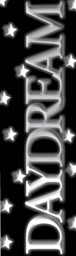

Here I developed a typographic theme cover for PRINT Magazine. This magazine cover is all about the total visual impact, using primarily type. The typography combined with a small image inserted as part of the statement to accent and or support the message grabbing the viewers attention. This Typographic creative approach is a visual that has potential to become a key to any PRINT ad/ TV ad / Online a still frame.
Wednesday, April 25, 2012
GRAPHIS Magazine


Here I have created two potential magazine covers for Graphis Magazine. My intentions were were to create two exciting unique views about what design is. Graphis packaging is all about the VISUAL impact and communication. Here I have two very different solutions both mastering that visual impact and ability to communicate design for Graphis Magazine.
Tuesday, April 24, 2012
Cross Country
 Here I have created a collage for recruits of the Westfield State Cross Country team. I chose words and images that I thought best represented the team in order to sell our program to potential Westfield student athletes. Each word that represents the Westfield Cross Country team is a letter in the school, WESTFIELD. W stands for Win and I have chosen a picture of teammates Kelsey Garvey, Lynsay Wray, and myself holding up a trophy after clinching the title MASCAC Champions. E stands for Excel, team captain Rach Cardin shows her hard work paying off giving her all in the home stretch of Westfield's home course Stanley Park. S stands for Support, thanks to the strong dedication of Coach Bill Devine Westfield Girls and Boys are given every opportunity to reach their goals and become the runners they want to be. T represents Team, a picture of the Westfield girls huddled together for one final pep talk before their championship meet. F stands for Friendships, Teammates and Roommates Nicole Foucher and Olivia Marshall hug after great performances in their cross country meet. I represents Improve, here we have a picture of the team wearing their championship tshirts after improving their XC record. E represents Education, a picture of Westfields mascot reminds us that we're here for an education. L represents Live, a picture of Westfield XC's boys and girls hanging out at a corn maze showing that friendships are carried on in and outside the teams practices. Last but not least D represents dream, a picture of the Westfield girls jumping in the air fully decked out in color and wackiness.
Fun with Personal Logotype


Here I decided to try out different colors for my logotype. I wanted to assure myself that I chose the right colors and design. I tried to perfect the logotype as best i could, knowing this logo was going to be used on my business card. Here my initials, C, R, and C are used to create my logotype. I overlapped the letter C's and placed a white R between them. I strategically placed the white letter R to make the negative space of the top C look like it is apart of the R. I thought this bold move would provide my logotype with character. It is important to master your logotype because it can define you as a graphic designer in the future. Your logotype and business card sell you and your graphic design capabilities so it is important that you take your time wit hit and make sure it speaks volumes about yourself.
Business Card


Habitat for Humanity


Nineism


Multiple Graphic Imaging: Based on a quadrant - the master image is use of a positive and negative typographic shapes. I've created a single modular image that I repeated 9 times using my own 3 initials C,R and C. I have worked out a 3" square master module with key touch and or contrasting points. Each turn of the modules in the ninist grid produced a different poster visual not just a pattern.
Monday, April 23, 2012
Display Font Poster


For this project I created a display font and a display font Poster.
Here I used an existing font and strategically placed button like
shapes around the letters. I chose to do a spin off of the font Bodoni
and created Buttoni When creating the display font poster i chose to
design a t-shirt with buttons on it to creatively display Buttoni.
Subscribe to:
Posts (Atom)